A New Era
Bonjour, tout le monde!
Mikey here, your friendly neighborhood Creative Director (and conspicuous consumption correspondent) here to elaborate, extrapolate and educate on all things Le Métier de Beauté!
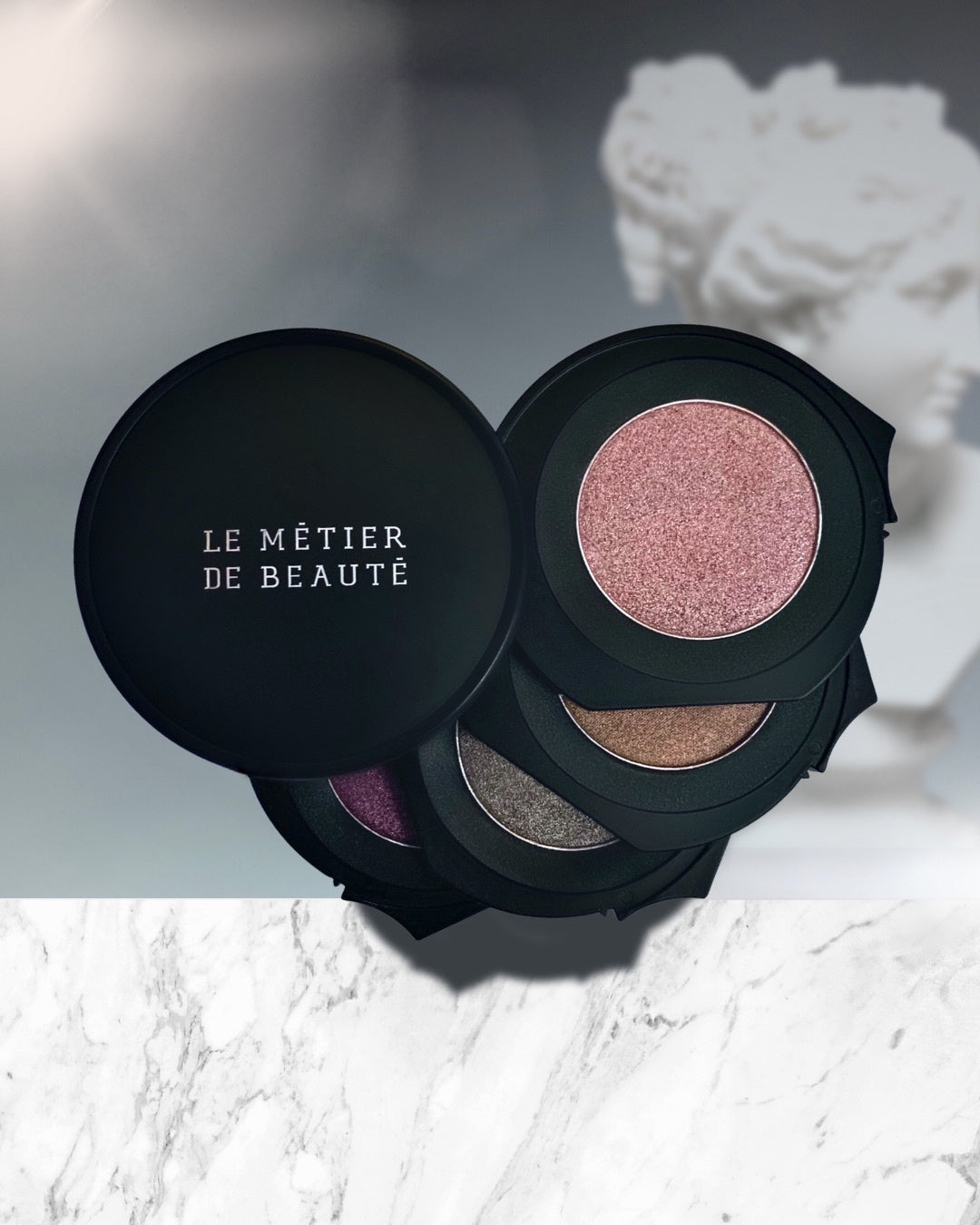
It seems only apropos to christen our beauty blog with a dynamic discourse (and rather prolix discussion) on our latest creation, aptly named, The Era of Restoration. This beautiful Kaleidoscope is a decadent collection of brilliant and buttery eyeshadows. It could be said that the current atmosphere in the world is such that one might not necessarily be inspired to thoughts of brilliance, buttery richness and decadence, but conversely, who's got the time to wait for the world to mirror the conditions of our dreams?
When the world offers tedious austerity and the doldrums, the recourse should be to bounce back with glamour and excitement. Contrast is the key! I've never understood the maxim of "fighting fire with fire". It seems improbable to expect an outcome other than everything on both ends being reduced to ash. I always thought the expression should be to fight fire with water! Doesn't this make more sense? It's like the concept of executing prisoners at dawn, didn't it occur to anyone that this might be a dreary way to start the day?
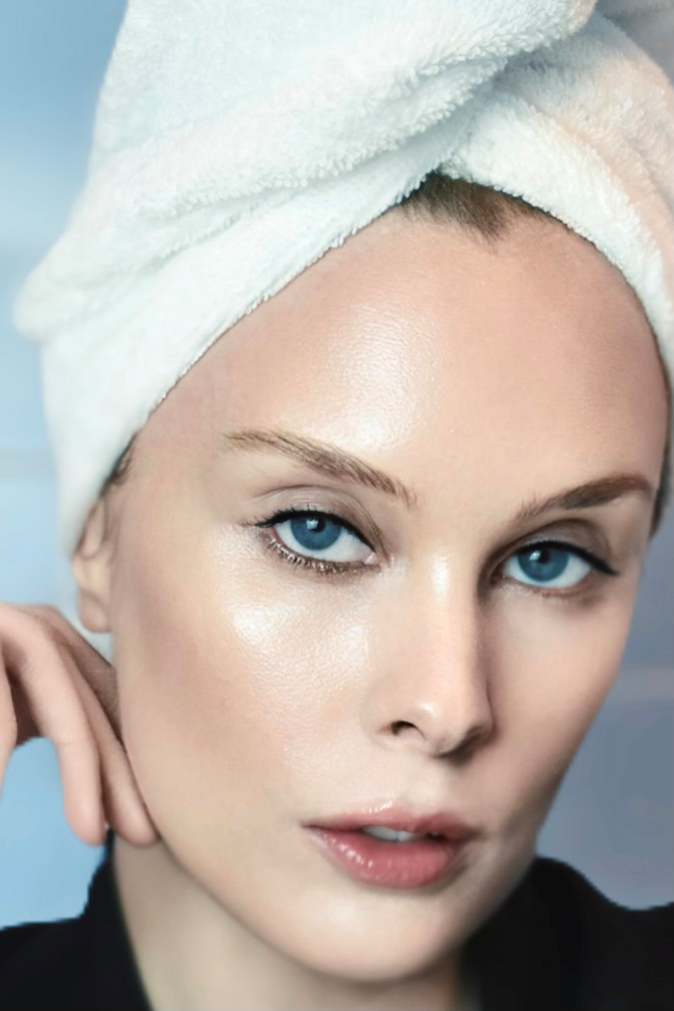
But I digress, let's get back to the elements of contrast when it comes to beauty! The most important aspect of bringing forth what we love (and receding what we love slightly less) is achieved by creating very tiny illusions of contrast. The reason I say tiny illusion, as opposed to a fully blanketing illusion, is because anything that is too obvious invariably appears tacky, whereas a very subtle distinction and refined detail will always appear more elegant. During many a makeup consultation I have heard clients ask me to extend their eyeliner as far out as possible to create the illusion that their eyes are further apart than they actually are. Frequently, this is a client that has heard the urban legend in beauty advice articles that the trick to making eyes appear more widely set is to wear extended cat eyeliner. In theory, this sounds like a perfectly feasible illusion that technically works. The problem with this trick, however, is that the "trick" in question is very obvious. When you see someone wearing cat eyeliner out towards their ears, one does not think: "Oh, her eyes are set wide apart". Rather, what one does think is: "Oh, she's wearing a lot of eyeliner."
As a makeup artist that represents a specific brand that employs the decidedly specific aesthetic of elegance, it is my experience that contrasting light and color with eyeshadows is a much more subtle and beautiful method to highlighting our finer features. Creating a modicum of contrast around almost anything will bring the object into focus. The absence of contrast, such as placing a white sheet of paper against a white wall (or pairing green eyeshadow with green eyes), causes the object in question to utterly disappear. To this end, employing eyeshadow shades that suffer at least a small measure of contrast will make your eyes appear to have a spotlight on them (a preferable illusion to conspicuous cat-eyeliner).
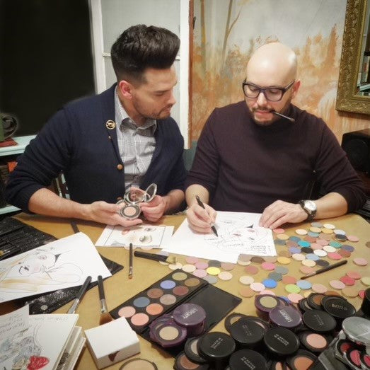
When we create Eyeshadow Kaleidoscopes, it is with a concentrated effort to avoid matchy-matchy color-palettes, like pairing eggshell with tan, medium brown, and dark brown. Such a palette could invariably turn the eyes to mud. This is likewise with "smoky" eyeshadow palettes that feature grey with silver, gunmetal and black. --Or lilac with magenta, purple and plum. They offer little to no contrast and are therefore not recommended to use by themselves. You would have to pack multiple palettes with a combined range of warm to cool and hot to cold colors. The idea of the Le Métier de Beauté Eyeshadow Kaleidoscope (besides being visually arresting), is to offer a self-contained, total look. To make the application steps easy, the base color is always placed at the tippy-top. The second tier goes next, followed by the third and finally the deepest shade at the bottom tier. The colors are not selected willy-nilly by caprice; there's a mathematical equation afoot. Each shade must serve a unique raison d'etre (a reason for being).
Let's go through the distinctions in the collection, The Era of Restoration...
Level 1: The top shade, Rococo, is multi-chromatic (cool pink with an undercurrent of warm gold). The color inspires Springtime, renewal and freshness.

Level 2: The descending shade beneath it, Caravaggio, is a sensible coppery tan (this is a work-horse shade with medium depth, suitable for daytime activities). Although the Kaleidoscope wields four shades, no one has to wear four eyeshadows at once. However, since most people who indeed wear eyeshadow do so with the objective of bringing out their eyes, it is important to note that one eyeshadow alone, even if it's the most beautiful color ever, will appear flat. There is something about single color that draws attention only onto itself and away from the eyes. To achieve the opposite effect, a minimum of two shades will suffice, preferably two shades that do not match (remember the white piece of paper against the white wall yields no contrast). One shade should ideally impart a touch of coolness, whilst the other a little warmth. When the two colors melt into each other, the cool tone contradicts the dullness in the warm shade. Conversely, the warmth of the tan helps to thaw the coldness of the pink. Together, the illusion of contrast performs the curious feat of bringing the focus to the eye color. It is the difference between someone remarking "what beautiful eye makeup you're wearing!" and "what beautiful eyes you have!" Perhaps a distinction more so than a difference, but there it is.

The next two shades in The Era of Restoration...
As I remarked earlier, it isn't necessary to wear all four shades at once since contrast can be achieved with two eyeshadows that yield tonal contradiction. Hence, the objective in wearing multiple contrasting hues (four and beyond) is to continue increasing the level of contrast intensity (like turning up the dial from a quiet storm to a raging category six). It's not often that one needs to be conspicuously flat-out gorgeous in the middle of the afternoon, but curiously, life does occasionally present unforeseen circumstances that can incite us to let them have it!
Level 3: Baroque, a sumptuous taupe! Like Caravaggio, Baroque is a work-horse shade in the sense that it is a universal color that is flattering on virtually all humans. Where they diverge is in their depth. Baroque is a deeper hue, a shadow than can bridge the look between day and night. It is a smokier eyeshadow, but let's not get it twisted, it's still just taupe... and not black. The fatale spirit is only implied! The application technique is to layer the third hue over the previous shadows, like a series of gossamer veils. The raison d'etre of this shade is to add mystery to an otherwise sweet and innocuous look.

Level 4: Vivaldi, a smoldering aubergine. This hue was selected to balance and contradict the neutrality in the previous taupe and tan shades. As stunning as jewel toned eyeshadows are to look at in a palette, they are not intended to be worn by themselves. They are high fashion accessory hues that require the fettering and restraint of the warmer (and dare I say, more conservative) shades like taupe, tan and rose. When they blend and melt into each other, the burgeoning combination further increases the contrast with the wearer's eye color. Allowing all of the layers to be visible through the veils of color, not unlike the aurora borealis, creates a truly beautiful, but complex prism of color. In this context, it bears repeating that complexity is a very important component of elegance. In fashion, fabrics that yield layers of delicate stitching and complex craftsmanship invoke the spirit of sophistication and elegance. Without these details, a garment can appear cheap. Likewise, a layered eyeshadow look with prismatic complexity makes for a difficult task in determining the exact color that one is wearing. Contrarily, a single flat eyeshadow can be detected and defined instantly from across a room and therefore hold no mystery. The sum of adding a little detail to a little detail and to another little detail and so on is what creates the aura of breathtaking elegance. One broad stroke with a frayed brush is not going to get it.

Once you embrace the technique of layering eyeshadow color (les couches de couleur) you'll find it a snap to command the optical illusion of navigating the attention towards your eyes, rather than your eyeshadow. --Or perhaps you may surmise from reading this, that yours truly is mining a little too much depth from a 3-millimeter tin of eyeshadow...but if I'm being honest, it's a source of ceaseless fascination!
--More gobbledygook and discourse to come!
Kindest Regards,

Comments
JB —
So lovely to “see” you again! I’ve really missed seeing you in stores and having the interactions. This was fantastic!
Hollan B Mahan —
I don’t even know where to start. My brain cannot wrap this technique. Interesting and I LOVE the look. First I thought no way, this will take to long. Now, I’m thinking this is a fun new look and mistake proof in essences. Thanks so much for taking the time. With mask use I find eyes even more important:) Great video and Thanks again!
Busterbird —
Les couches de coleur has changed the way I apply eyeshadow. No more light on the brow bone, medium on the lid and dark in the crease. I’m using color combos I never would have considered before – thank you for the video! I love the blog. Congrats. ❤❤❤
Rachael —
Loving the layering technique!